
Packaging / BRANDING / Print
Maniq
Shining a Light On Bipolar Disorder

Maniq
Sometimes the most powerful brands emerge from the most personal struggles. Even approached us wanting to create a wine called MANIC to honor his partner Khrischen’s journey with bipolar disorder.
The naming breakthrough
When Even suggested “MANIC,” I was reminded of a recent brainstorming session for a product that ended with “IQ”. I loved how the non-traditional spelling made the otherwise clinical word extraordinarily memorable and tied to the concept of “being intelligent”, so I suggested MANIQ. Even instantly loved it. It was distinctive, memorable and captured what they wanted to express.
The treasure hunt begins
As we did our usual exploration, Even shared that when Khrischen is in a depressive state, he adds layers of paint to a mannequin, using it as his canvas. During the next depressive episode, he paints over the old layers with new paint, writing himself dark, pain-filled messages and frustration intermixed with messages of patience, grace and hope.
The moment I heard this, I knew we’d found our treasure. The mannequin was a perfect metaphor for bipolar disorder—there was a front and a back, dark and light and always the possibility of renewal.
The design solution
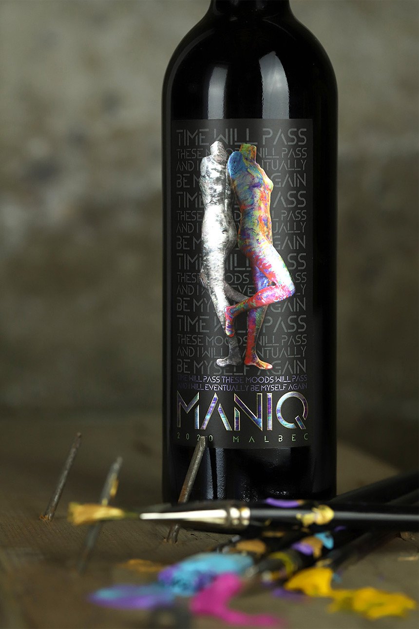
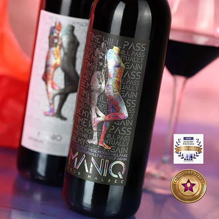
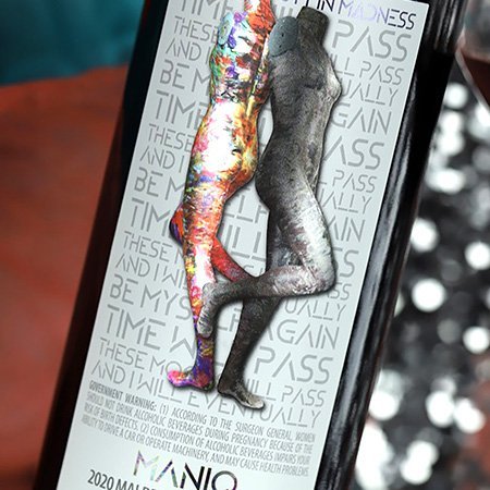
We photographed both sides of Khrischen’s painted mannequin. These became the foundation for a dual-label design. The back label features a white background with two mannequin images back-to-back: one in full color representing the manic state, one in black and white representing depression. Behind them, the repetitive phrase “Time will pass and I will eventually be myself again” with the tagline “find beauty in madness.”
The front label mirrors this design but with a stark black background—a powerful contrast that reinforces the heavy side of the condition.
We printed these labels on silver metallic stock, allowing the silver to shine through only on the mannequins and the logo to replicate the metallic paints Khrischen uses.
The hidden message of hope
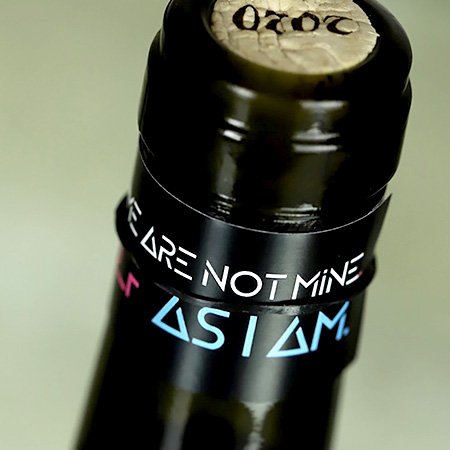
A tag is attached to the bottle’s neck with a nearly invisible black plastic band. Much like a fortune cookie, when removed it reveals a unique message of empathy and grace on one side and NAMI.org contact information on the other—turning every bottle into a potential lifeline.
The result
This brand isn’t just about making an impact—it’s about making a difference. By turning a wine bottle into a platform for awareness and support, MANIQ challenges stigma and sparks conversation—proving that wine branding can do more than sell bottles. It can change lives.
Collaborator
Khrischen Alvarez, artist
Awards & Recognition
Gold Medal. Lone Star International Wine Label Competition, 2025
Wine Business Monthly Pack Awards: Third Place, Luxury Packaging Category, 2025
Media
Gold Medal. Lone Star International Wine Label Competition, 2025. Experience 46°: See Beauty in the Madness: The Story Behind Maniq Wines, Article Here.
Third Place, Wine Business Monthly Pack Awards, 2025, Luxury Division
This label really stands out—our customers are always commenting on how much they love it.