Packaging / BRANDING / Print
Strata Varia
Expansive Vision

Strata Varia
Sometimes the most rewarding projects begin with a client who already understands the power of authentic storytelling. Brent Roberts came to us with a clear vision: he wanted to capture Washington State’s remarkable geological diversity in a wine brand that would honor both the land and his family’s journey from Walla Walla to San Juan Island. (A journey from the southeast corner of the state to the northwest corner—7 to 8 hours by car).
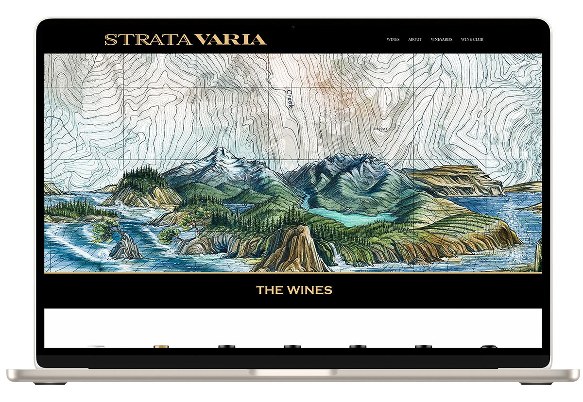
Brent had already commissioned artist Katie Riem to create a composite landscape painting—a 350-mile visual journey from the Rain Forests of the Olympic Penninsula through the Cascade peaks, across the desert to the rolling wheatfields of the Palouse. But he was struggling with the brand name and requested our help with the technical execution.
Hitting the naming jackpot!
Brent’s initial name concept was disconnected from his vision for the label, so we dug deeper and focused on the geological story he wanted to tell. We suggested incorporating the word ‘strata’ into the name.
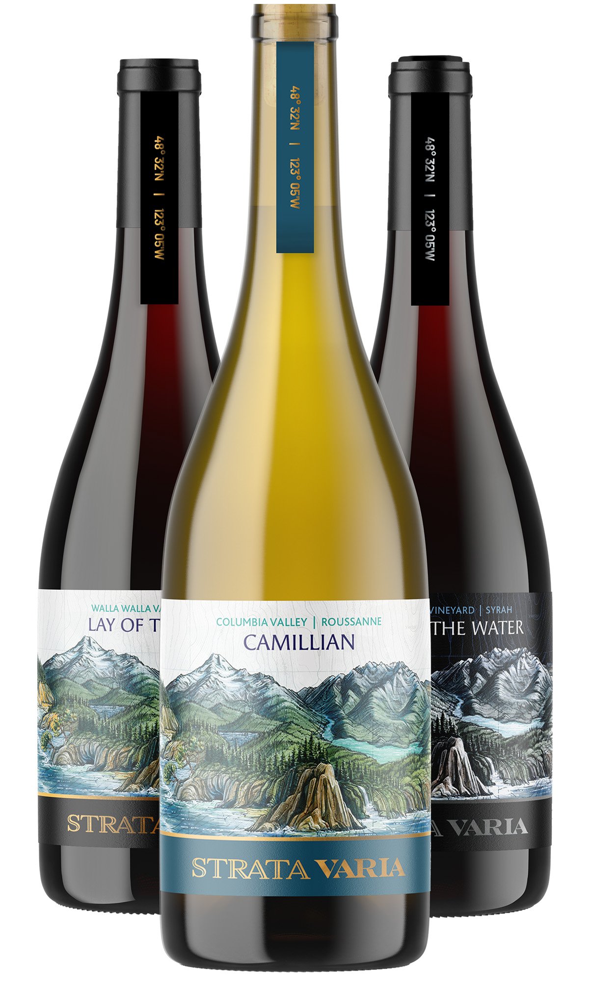
A few days later, Brent came back with “Strata Varia.” It was gold. The Latin translation —”different layers”— perfectly captured both the wine’s complexity and the varied geological formations that encircle every bottle.
We also recognized the phonetic similarity to “Stradivarius” (the maker of some of the most legendary and valuable violins ever created). Associating his well-made wines with legendary craftsmanship, rarity and timeless quality was perfect.
Collaboration with the Artist
A beautiful illustration needs strategic design thinking to work as effective packaging. We created detailed guidance for Katie, mapping out the label format to ensure adequate space for bottle variations, TTB requirements and fanciful names
The final touch
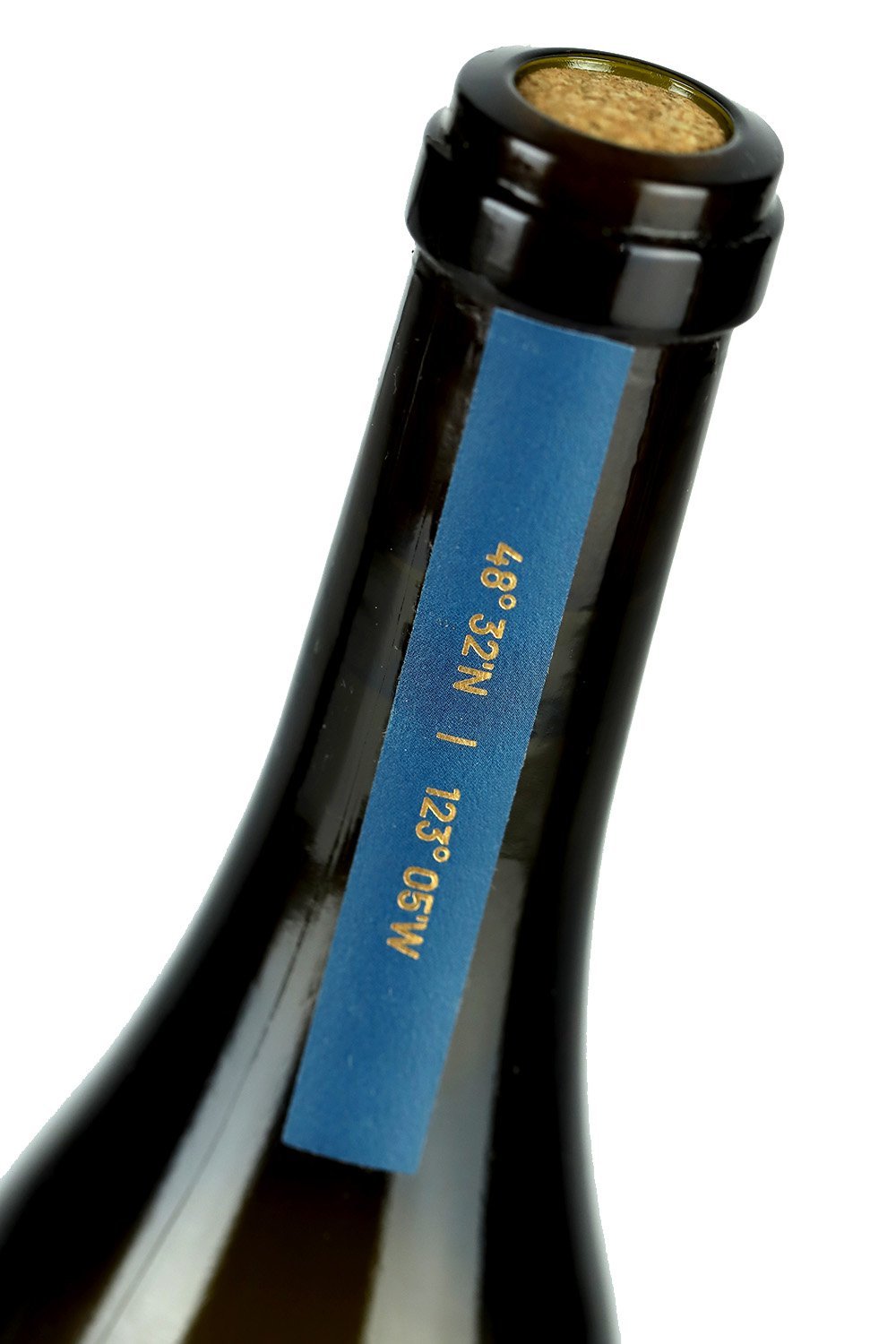
Because their San Juan Island location sits far from Washington’s wine country, we incorporated the coordinates for San Juan Island into a vertical neck label—turning their geographic isolation into a point of intrigue and discovery. It also served as as an embellishment on an otherwise bare neck.
A visual journey
Strata Varia proves that when an authentic vision meets strategic execution, the result is a brand that’s both beautiful and unforgettable.
Collaborators
Katie Riem, artist