
Trends don’t happen in a vacuum…
They reflect what’s happening with producers, consumers and the culture. In 2026, budgets are tighter. People are drinking differently. They’re looking for connection. And on the shelf, some of the most interesting brands are getting a little quirky.
Here’s what we’re seeing at Sara Nelson Design.
How Can I Cut Costs on my Packaging?
This is the question we hear most often.
Money is tight. And wine still needs to be moved out of the tank or barrel, bottled, labeled and sold. But our clients are looking for help in bringing production costs down.
Sometimes that means doing without an embellishment. Sometimes it means switching printers or reconsidering material choices.
These days it often means asking AI to generate concepts rather than hiring a designer or forgoing foundational work when creating or refreshing a brand. Skipping those is not a great idea. There’s more to this than a generic pretty image.
We see many producers doing away with capsules altogether. This saves money and reduces waste, and the finished package can also look clean, fresh and contemporary. What began as a cost-saving decision can actually serve as an aesthetic one as well.
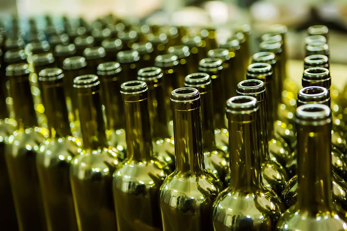
We are beginning to see producers switch to lighter-weight bottles. For decades, a nice heavy bottle was the first cue that you had an exceptional bottle of wine. As shipping costs have skyrocketed, reducing bottle weight has become both good business and one more way to keep wines competitively priced.
There’s nothing wrong with designing to a budget. Constraints can produce some very smart design. The danger is assuming that every dollar removed from the label is a dollar saved. Cheap production choices can become expensive if they make the wine easy to overlook or less compelling to buy.
At Sara Nelson Design, we’ve written more extensively about how to reduce wine label production costs without sacrificing the brand. You can find “Pro Tips for Keeping Wine Packaging Costs Down Without Compromising Quality” here.
Humans Long for Connection

For all of the technology making our lives faster, more convenient and seemingly more connected through social media, people are quite hungry for something decidedly low-tech: each other.
We’re seeing clients build wine brands around gathering, friendship, conversation and the simple pleasure of sitting around a table together, where deep personal bonds are formed.
Wine has always belonged in that world. But the emphasis is different now—far more intentional. Increasingly, connection is part of the brand itself.
That changes the design language. The most successful expressions feel warm, generous and human.
Drinking Less Doesn’t Mean Caring Less
Consumers are smart. They’re making thoughtful decisions about when and how much they drink. They’re generally consistent – conscientious about what they eat as well as drink.
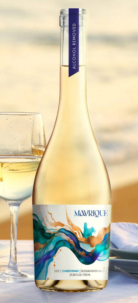
Non-alcoholic wine has been a significant part of our workload this year, and that’s no accident. Moderation, wellness and changing attitudes toward alcohol are reshaping the category.
We’re seeing a significant rise in new non-alcoholic and alcohol-removed wine brands being developed for different audiences and reasons:
- Alcohol doesn’t align with the brand creator’s values or those of their audience.
- Consumers with high-performance lifestyles—including those drawn to exotic car culture—want all of the tradition and celebration without the risk.
- In industries such as law and finance, social drinking is an expected part of the culture, but discretion and clarity matter.
Wineries are selling non-alcohol (NA) wines alongside their traditional offerings because people want to stay longer, even after they’ve reached their personal consumption limit.
They Still Want the Feels
Consumers still want the beautiful bottle on the table. They want something that feels appropriate for dinner, a celebration or a Thursday night with friends. They want choice without compromise.
NA wine packaging needs to communicate everything other wine packaging communicates while playing by the rules of the FDA rather than the TTB. And those are very different rules.
The “smart consumer” trend isn’t specific to wine. At the same time as we’re developing NA wine brands, we’re creating organic wine brands and branding for Kipos, a company that sells biological agents as alternatives to harmful pesticides and herbicides. Across categories, people want products that protect the health of their families and pets.
Quirky Trumps Perfection
At the more accessible end of the wine shelf, we’re seeing labels become quirkier, higher contrast and more visibly hand-hewn.
Illustration. Unexpected typography. Strange characters. Bold color relationships. Art that looks like it was made by a person. We see this as a direct rejection of pixel-perfect, AI-generated design.
There’s an immediacy to these labels that works particularly well for moderately priced wines. They aren’t trying to communicate old-world grandeur or luxury. They’re trying to catch your eye, make you curious and give you a reason to pick up the bottle and take it home for dinner.
After years of beautifully restrained labels, bold awkwardness feels surprisingly fresh. In a category where getting noticed is half the battle, being quirky may be a very practical strategy.
What’s Next?
The next wine packaging trend may not start with design at all.
Extended Producer Responsibility, or EPR, is changing the conversation around packaging. As producers are required to take more responsibility for what happens to packaging after it’s used, every component of the container becomes part of the equation: glass, paper, capsules, closures and even adhesives.
Wine packaging decisions are often made years before release. Many of our clients are making decisions today for wines that may not reach the market for five or even ten years. That puts the regulatory horizon squarely inside the wine production cycle.
This pressure is likely to reinforce several trends that we’re already seeing: fewer components, less material and more thoughtful production choices.
That’s where things get interesting for designers.
Reducing packaging doesn’t have to mean reducing the experience. A bottle without a capsule can feel intentional rather than unfinished. A label without foil or embossing can still be beautiful. Lightweight glass can still feel premium.
The definition of premium wine packaging is evolving
Historically, luxury was often communicated through weight and material excess—heavy bottles, die-cast medallions and wax dips. Increasingly, sophistication is being expressed through intentionality, restraint and material intelligence instead.
We believe constraints force us to prioritize. The wine labels of the next few years will likely be defined as much by the things we omit as by the things we add. (Speaking of constraints, here’s a refresher on what the TTB will both allow and require on your new label.)
If you are working to think through the effect of brand and label trends on your position or product, Sara Nelson Design can help. Drop us a note to Start a Conversation and we’ll be in touch!
Color decisions aren’t simply aesthetic—they’re influenced by culture, psychology and how audiences respond to a brand. See Sara’s look at why major forecasters converged on green for 2026.