Winery Branding
and Brand Development

Belonging Matters.

The story you tell over a glass may hold the very thing your wine brand needs—a sense of place, an unexpected beginning, or a conviction that guides every vintage.

We ask the questions that bring those details to light. Then we transform them into a distinctive winery brand identity that gives people a reason to choose your wine—and a story worth sharing.

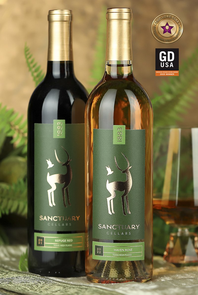
Sanctuary Cellars wine label with rich green artwork, animal imagery, and rose gold foil

Sanctuary Cellars

Unwind in good company

Set alongside an animal sanctuary near New Braunfels, Texas, Sanctuary Cellars offers a wine experience unlike any other. Guests enjoy their wines while observing wildlife in a natural setting—an experience that became the foundation of the winery’s brand identity.

We developed a visual identity inspired by the sanctuary itself. Rich greens evoke the surrounding landscape and its sense of tranquility, while rose gold foil adds warmth and sophistication. The animal imagery connects the wines to the sanctuary experience, creating a distinctive, cohesive brand that tells the winery’s story.

Awards & Recognition

  • Gold Medal, Lone Star Int’l Wine Label Competition, 2023
  • American Package Design Award, 2025
  • Featured in Graphic Design USA Magazine, May 2025
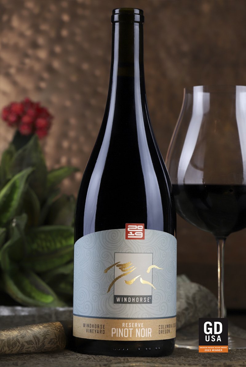
Windhorse Wines label showing Salmon-Safe and LIVE certifications, with no capsule on the bottle

Windhorse Wines

A Brand Defined by Values

For Windhorse Wines, sustainability isn’t simply a practice—it’s central to the winery’s identity. Their commitment to responsible farming and environmental stewardship became the foundation of a brand designed to communicate those values.

We translated that commitment into a visual identity through carefully chosen colors, textures, imagery, and storytelling. Salmon-Safe and LIVE certifications feature prominently on the label, reinforcing the winery’s environmental priorities.

Even the absence of a traditional capsule serves a purpose: reducing unnecessary waste while creating a clean, distinctive presentation.

Awards & Recognition

  • San Francisco International Wine Label Awards, 2019
  • American Graphic Design Award, 2022
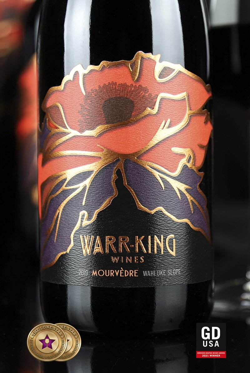
Warr-King wine label with botanical illustrations and Arts and Crafts-style typography

Warr-King

Built on Craftsmanship + Hospitality

When we began to develop the brand identity for Warr-King Wines, the name initially suggested wartime imagery. But conversations with founder Lisa Packer revealed a different story—one rooted in gracious hospitality, meticulous winemaking, and a deep appreciation for craftsmanship.

That story led us to the Arts and Crafts movement of the early 1900s, an era that celebrated quality, artistry, and attention to detail.

We brought those influences into the winery’s visual identity through expressive botanical illustrations, rich colors, and period-inspired typography. The result is a brand that reflects both the care that goes into making the wine and the pleasure of sharing it.

After selling Warr-King, Lisa eventually returned to winemaking with a new venture, Mana Vintners, another brand-development project featured below.

Awards & Recognition

  • Gold Medal, Lone Star Int’l Wine Label Competition, 2023
  • American Package Design Award, 2025
  • Featured in Graphic Design USA Magazine, May 2025
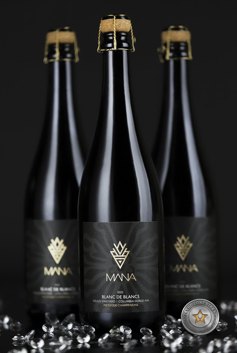
Mana Vintners black wine label with gold foil and stylized Hawaiian flowers

Mana Vintners

Women of Strength, Faith & Influence

When Lisa and Alan Packer returned to winemaking, they again turned to Sara Nelson Design to create an identity for their new venture. Mana Vintners honors “Mana Wahine”—women of strength, faith, and influence whose spirit inspires and empowers others.

The brand identity draws on geometric forms and stylized Hawaiian flowers, combining cultural inspiration with a sophisticated, contemporary aesthetic. Distinctive floral illustrations differentiate the red and white wines while maintaining a cohesive visual identity across the collection.

Gold foil, embossed details, richly textured papers, and a dramatic black palette give the packaging a commanding presence. Each material was chosen to communicate the brand’s strength, elegance, and premium character.

The result is a distinctive wine brand that celebrates the people and values behind its creation.

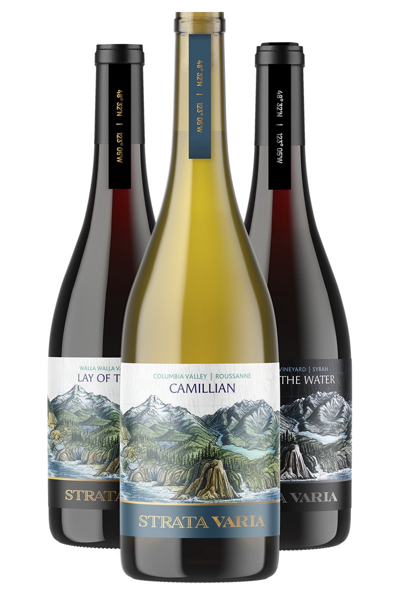
StrataVaria wine label featuring an illustration of Washington’s layered landscapes

Stratavaria

Every Element Reinforces the Message

Brent Roberts came to us with a vision for a wine brand celebrating Washington’s extraordinary geological diversity. He had commissioned artist Katie Reim to create an illustration depicting a 350-mile journey across the state, capturing the landscapes and geological formations that make Washington wine country distinctive.

Our challenge was to develop a brand identity that complemented the artwork and brought the entire concept together.

Sara suggested exploring names built around the word “strata,” reflecting the layers of geological history represented in the illustration. A few days later, Brent returned with StrataVaria—a name that captured the concept beautifully.

Evoking the idea of different layers, StrataVaria connects the complexity of the wines with the geological formations depicted on the labels. Its resemblance to Stradivarius also suggests the artistry and craftsmanship behind exceptional winemaking.

Even the neck labels contribute to the story. Geographic coordinates identify the winery’s remote location, turning another packaging detail into an invitation to discover the place behind the wines.

From the name and artwork to the smallest label detail, every element reinforces a distinctive and cohesive wine brand.

Awards & Recognition

  • American Package Design Award, 2026
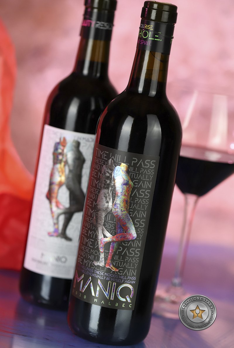
MANIQ wine label with expressive contrasting artwork and a neck label carrying an affirmation and NAMI reference

Maniq

A Brand with a Purpose

MANIQ was created to raise awareness of bipolar disorder while celebrating the beauty found in life’s contrasts. Its identity brings together artistic expression, affirmation, and advocacy in a wine brand designed to inspire conversation and understanding.

The packaging reflects that mission through expressive artwork, contrasting imagery, and carefully integrated messaging. Each bottle carries a neck label featuring a personal affirmation on one side and a reference to NAMI, the National Alliance on Mental Illness, on the other, connecting the brand’s message with a resource for those seeking support.

By weaving art, awareness, and encouragement into a cohesive brand identity, MANIQ communicates a simple but powerful belief: even in life’s most difficult contrasts, there can be beauty.

Awards & Recognition

  • Gold Medal, Lone Star Int’l Wine Label Competition, 2025
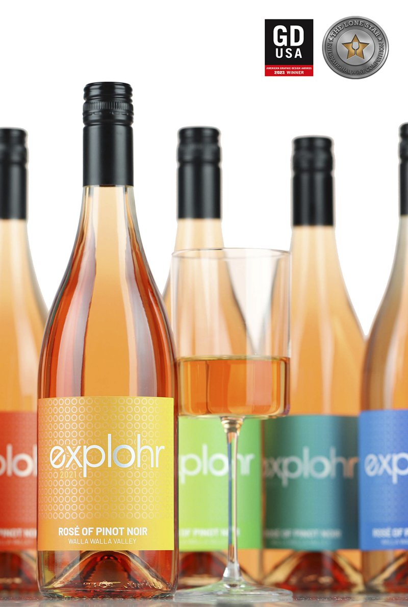
Explohr wine labels in a spectrum of vibrant colors

Explohr

Inclusivity + exploration define the brand

Rob Wohr came to us with a simple but compelling vision: create a wine brand that encourages curiosity and exploration while making everyone feel welcome, regardless of their wine knowledge or experience.

We developed the name Explohr, incorporating Rob’s surname into an invitation to discover something new. The tagline, “Seek. Find. Love. Wine.” gave the brand a distinctive voice—encouraging exploration without prescribing what wine should look or taste like.

That spirit of inclusivity became central to the visual identity. A vibrant spectrum of colors across six wine labels creates an approachable, cohesive collection, reinforcing the idea that wine is something everyone can enjoy and explore.

From naming and messaging to packaging design, every element works together to make wine discovery feel inviting rather than intimidating.

Awards & Recognition

  • GDUSA American Graphic Design Award, 2022

In Their Own Words

“Sara is amazingly creative and helped me build my brand from name to label! If you need to build a brand from scratch or refresh an existing one, don’t hesitate to use Sara Nelson Design.”
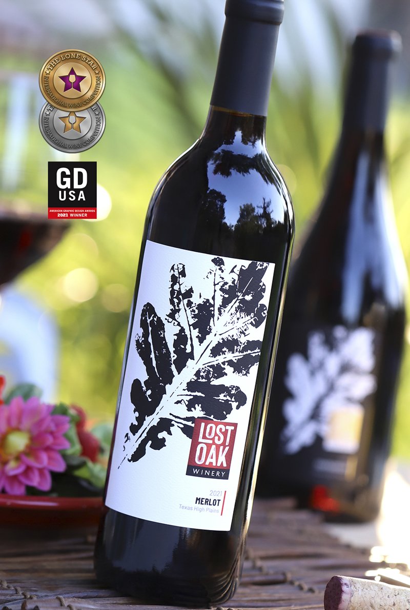
Lost Oak Winery wine label with oak leaf and tree ring illustrations

Lost Oak Winery

A brand refresh

A new generation of leadership gave Lost Oak Winery in Burleson, Texas, an opportunity to reimagine its brand. The challenge was to create a fresh, welcoming identity that reflected the winery’s evolving personality while preserving its reputation for quality.

We replaced the traditional grape-leaf logo and dark visual styling with a bold, contemporary identity. Expressive illustrations of oak leaves and tree rings connect the new design to the winery’s name, creating a recognizable visual language that feels both energetic and approachable.

The result is a refreshed winery brand that balances personality with sophistication—comfortable enough for an everyday gathering, yet polished enough for a special occasion.

Awards & Recognition

  • American Package Design Award, 2022

In Their Own Words

“…she not only asks all the right questions, but she is able to bridge the gap between ideas and concepts to something tangible and beautiful.”

—Roxanne Myers, President

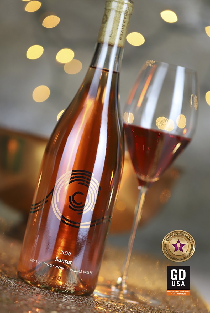
Cedar River Cellars wine label with clean geometric design inspired by cedar and water

Cedar River Cellars

Precision made visible

Working with Micah Nasarow of Cedar River Cellars, we discovered a winemaker whose dedication to precision extends to the smallest details of his craft. We wanted to create a brand identity that reflected that exacting approach while remaining approachable and memorable.

Our early explorations drew inspiration from the Fibonacci sequence and sacred geometry—mathematical concepts that echoed Micah’s fascination with precision. But the challenge was to communicate those qualities in a way that wine enthusiasts could recognize and appreciate immediately.

The solution brought together three defining elements: cedar, water, and a visual expression of precision. Clean geometry and a restrained, Pacific Northwest-inspired aesthetic created a distinctive identity that connects the winery’s name with the philosophy behind its wines.

The result is a brand that balances the organic and the exact—expressing both the natural origins of the wine and the meticulous craftsmanship involved in making it.

Awards & Recognition

  • American Package Design Award, 2021
  • Gold Medal, Lone Star Int’l Wine Label Competition, 2020
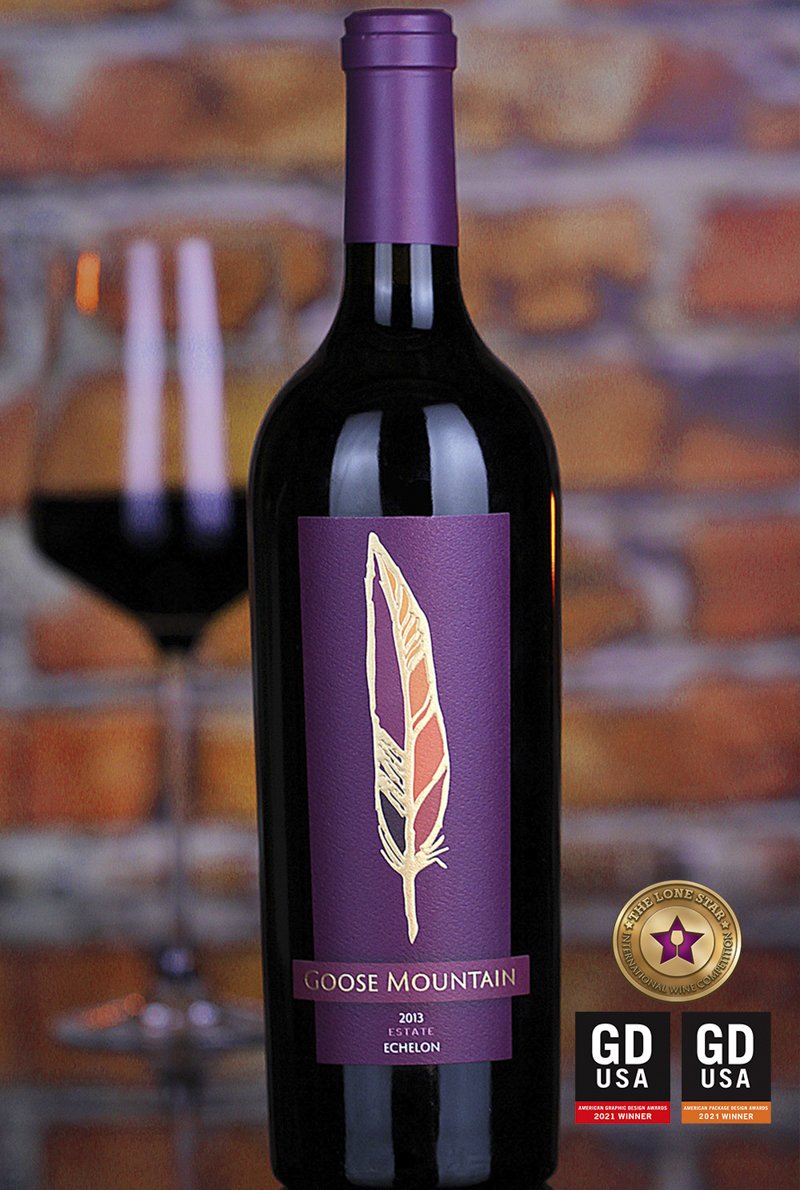
Goose Mountain wine label with a goose feather turned on its side to form a mountain silhouette

Destination Brands

A sense of place. A promise of luxury.

Goose Mountain takes its name from the long, low ridge that defines the Goose Ridge estate in Washington wine country. We used that distinctive landscape as the foundation for a wine brand rooted in place and elevated by an unmistakable sense of luxury.

The visual identity centers on a deceptively simple idea: a goose feather that, when turned on its side, becomes the silhouette of the mountain. This connection between name, landscape, and imagery gives the brand a memorable symbol, while a rich, sophisticated color palette reinforces its premium positioning.

The identity resonated so strongly with the client that, with a few refinements, it was adopted for the parent company, Destination Brands. The expanded brand represents wines sourced exclusively from the Goose Mountain and Goose Gap areas.

What began as an identity for a single wine became the visual foundation for a broader family of wines.

Let's Build Your Winery Brand That Stands Apart

Whether you're launching a new winery, refreshing an established brand, or introducing a new wine to the market, the right branding can make all the difference. At Sara Nelson Design, we bring strategy, creativity, and decades of experience to building winery brands and packaging that connect with consumers and stand out in a competitive marketplace.