
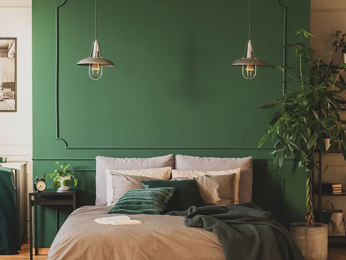
Forbes reached out looking for color experts to explain why Behr, WGSN and Valspar all independently chose green variants for their 2026 Color of the Year picks.
I wasn’t surprised.
When Chaos Strikes, we surround ourselves with Green
Color forecasting: it’s not about trends. It’s about psychology. When the world feels chaotic, our collective psyche craves peace and tranquility. We surround ourselves with colors that provide that emotional salve. Greens and blue-greens (such as Teal) deliver that psychological impact.
Think about what’s competing for our attention right now: fears over AI impacts, economic uncertainty, geopolitical tensions and even grocery prices. When an entire generation openly discusses anxiety disorders and emotional regulation issues, they’re actively seeking visual comfort in their environment.
I witnessed this firsthand at a Portland mall recently. Several stores overflowed with shapeless stuffies marketed to young people seeking emotional support. That’s the same psychological need that is driving the 2026 green convergence, just a different expression.
The Historical Pattern
If you research the last 80 years, the pattern becomes clear:
- Early 1970s: Vietnam War recovery drove avocado green dominance
- Mid-1980s: Economic recession brought teal and turquoise
- Late-1990s: Y2K anxiety sparked teal and aqua trends
- 2014-2018: Political upheaval led to teal preferences once again
- 2025: AI disruption and global tensions create green convergence.
Looking at Pantone’s own history, green and teal variants appeared as Color of the Year in 6 out of 19 years between 2000-2018—nearly one-third of all selections. Every single time, they coincided with periods of cultural upheaval when our collective psyche craved the emotional comfort these colors provide.
Beyond Surface Trends
This isn’t just about pretty colors. It’s about recognizing how human psychology responds to collective stress through visual comfort-seeking. When three major color authorities independently choose shades of green they’re not following each other—they’re all reading the same cultural tea leaves.
Something interesting: nearly everyone can look good wearing teal. It’s especially flattering on blue-eyed people. That universal wearability adds commercial viability to psychological appeal!
What This Means for Your Brand
If you are developing products, packaging or interior spaces for 2026, understand that your audience is craving “calm” even if they don’t yet recognize it. The brands that recognize this psychological need and respond with authentic, grounding design choices will connect more deeply than those chasing trends.
Sometimes the most powerful design insight isn’t about what’s coming next—it’s about understanding why we need what we need when we need it.
One Last Note
Color forecasting is done two to five years in advance. (Here is a closer look at the selection process.) As a result, those of us who are involved in forecasting colors look at the following — and in the following order:
- What is going on culturally at the moment? (Politics, entertainment, fashion, fears, activities, etc.)
- Where is society headed because of that?
- How will society respond to the change?
- What emotional needs will need to be met?
- And finally, what colors address that psychological need?
We Can Help You Sort Through That!
If we can help you think through your brand’s color palette, feel free to give us a call: (509) 545-4584 or find our contact form online at https://saranelson.com.
See how Sara Nelson Design approaches brand strategy and design.